Tuesday, 22 June 2010
Tuesday, 1 June 2010
Monday, 31 May 2010
Kerrie Jane Stritton

I chose to look at Kerrie Jane Stritton because alot of her work focuses on physical boundaries, such as this painting with the dark hostile looking wall. I will also look into using gritty urban landscapes in parts of my work. Below is a quick painting i did in the style of kerrie jane stritton...

Rezi Lankveld

Im not quite sure exactly how Rezi Lankveld creates these incredibly fluid oil paintings, but what i do know is that i like them. I will be doing a few drawings that will just give an impression of the subject.
Sunday, 30 May 2010
Barnaby Furnas


I was looking through a book on contemporary art and i found Barnaby Furnas's work. It was particularly eye catching the bright clashing colour combined with the sometimes gruesome subject matter is hard to ignore. I felt his work relevant to mine in that it is very expressive loose and colour full which is my basic criteria for this project. The last of these images is a particular favorite of mine. The effect of people exploding and disintegrating is very likely to feature in my final piece.
Micheal Andrews.

Unfortunately this is the best quality photo i could find of his series of paintings entitled "Good and Bad at Games". The Title refers to the social games that people play at social events, the people fade or grow through out the night. I really like these paintings because they are very odd. They also seem to capture something of an uneasy party atmosphere. i chose to look at these paintings as they are a study of social boundaries and dynamics which is another facet of my project.
Juan Munoz

The sculptor Juan Munoz was another good starting point for my research. A lot of his work looks at physical limits (or boundary's). Things like the Weebles, the figures with no legs just a round sack, look horribly stuck and trapped by their own bodies. At the same time they look like some kind of toy, kind of fun and comical.

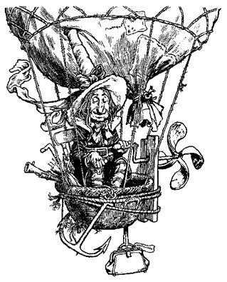
Heath Robinson.
 j
j
Heath robinson creates these really interesting Illustrations/designs about complicated machines that often do mundane tasks. I thought i should look at his work as i was considering using gifs to do a moving machine similar to Heath Robinson's machines. Much of his work was a satirical comment on the new modern style that was emerging in Brittan in the 1920's.
Tuesday, 25 May 2010
Jean Jullien

I like the use of speech bubbles that ask questions about the event. The interplay between bubble and answer is more engaging than just straight times and dates in a block of text. Also you are rewarded with a slight visual joke at the end which is always nice.
Thursday, 20 May 2010
Thursday, 13 May 2010
This isn't an artists work, as such, but the product of scientific research into vocal cords and artificial speech. I thought it was kinda interesting (as well as very funny) so i put it into my research. i don't know weather i'll incorporate it into my work but still its fun and odd. Kinda like something from a David Lynch film.
Tuesday, 4 May 2010
Anthony Lister


I really like the way Anthony Lister paints, its very loose with wet dripping paint and bright vivid colour. The subject of these series of paintings are superhero's in a kind of odd and distorted way. Really nice stuff and the use of colour has defiantly influenced the way i will paint for this project.
Monday, 19 April 2010
Animate

Sunday, 4 April 2010
Minilogue/hitchhikers choice
This is more similar to the white board animation i mean. its very quick and theres a lot going on. i don't know how long this would take but i would imagine its quite a quick method of working. Using a white board is a vary cheap method of working because essentially you only need one frame which you continuously draw on.
MUTO a wall-painted animation by BLU
This is nice, been looking for it for a while. Its not really how i see my final piece looking but its something similar to what i want to attempt doing with a white board. The transitions between sequences are very clever and inventive. Also the sound track fits the animation perfectly.
Friday, 2 April 2010
La Boca


Nice use of colour texture and gradients in La Boca's work. The Fantasy landscapes that are integrated into the works seem to be eerie planetary terrains.
Friday, 26 March 2010


Aurélien Arnaud


Im really enjoying the work of French graphic designer Aurélien Arnaud. The fluidity of the first poster works perfectly as none of the clarity of message has been lost. The second is made of pictures of sea and tropical paradises which instantly gives the viewer a disposition to be pleased and relaxed by the image even if the don't instantly realize what the pictures are of. The last poster is a glitchy mess but still has clarity of text until the last word which most people can probably fill in for them selfs as it is such a commonly seen phrase. Nice interesting work, though this isn't really what im doing for my final piece it may inform the style of some of the back up posters i'll make.


Monday, 15 March 2010


Sunday, 14 March 2010


Friday, 12 March 2010

Ron Mueck
I happened to be in Manchester the other day, so like a good little art student i took a quick trip to the Manchester art gallery. Was nice, had a lot of older work from the Pre-Raphaelite period which didn't really float my boat. There was a Frances Bacon painting which i enjoyed seeing in the flesh, as well as a more contemporary section. These striking figures took center stage...


Subscribe to:
Comments (Atom)